Clover Meadows | Bringing Nature Back to Skincare

Rooted in Nature, Designed with Intention
Clover Meadows is a natural skincare brand inspired by the quiet beauty of the countryside — fields of wild clover, soft light, and simple living. The founder approached me to craft a cohesive brand identity and storytelling framework that reflected their mission: creating clean, botanical-based products that nurture both skin and spirit. The goal was to build an artisanal brand that feels pure, grounded, and thoughtfully made.
From Generic to Genuine
Before our collaboration, Clover Meadows lacked a clear visual direction and distinct voice. Their early designs felt impersonal — too polished, not soulful. The challenge was to translate their core values of purity, honesty, and slow beauty into an identity that evoked warmth, trust, and timeless simplicity.
Cultivating the Vision
Guided by discernment, logic, and creative strategy, I began by immersing myself in the natural skincare landscape — studying how consumers connect with brands that feel both modern and earthy.
I built a creative strategy rooted in organic textures and pastoral storytelling, blending cottagecore softness with minimalist sophistication.
Key creative steps included:
Developing a brand story anchored in wellness, craftsmanship, and natural grace.
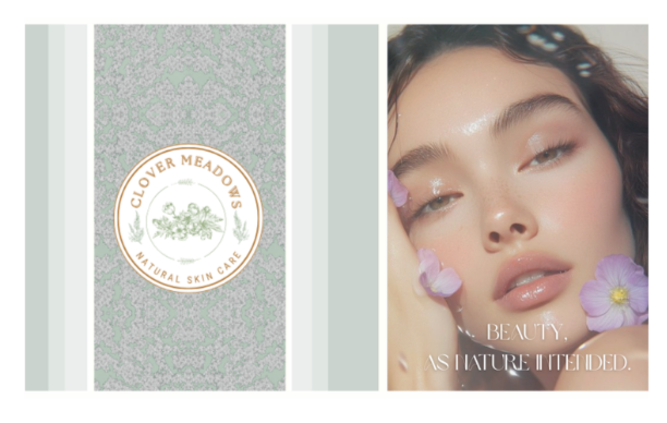
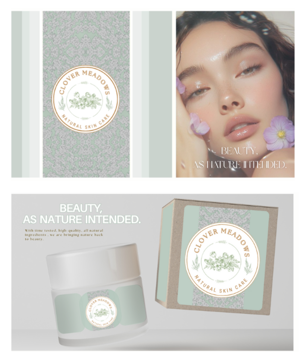
Designing a logo system inspired by clover leaves and meadow silhouettes.
Choosing a color palette of soft greens, creams, and sun-washed neutrals to evoke calm and authenticity.
Creating packaging concepts with linen-like textures, minimal typography, and subtle botanical illustrations.
Crafting brand guidelines to sustain a consistent voice across all platforms.
A Brand that Blooms Naturally
The final identity radiated sincerity and serenity — evoking the feeling of walking through an open field at dawn. The launch visuals gave Clover Meadows a cohesive, elevated presence across social media, packaging, and web. The brand’s look and language now reflect its essence: pure, handcrafted, and intentionally beautiful.
Reflections from the Meadow
This project proved that good design grows from empathy and clarity. By pairing aesthetic sensitivity with strategic storytelling, I helped Clover Meadows find its visual voice — one that whispers instead of shouts, but leaves a lasting impression.