Solflora Teas | Capturing Sunshine in Every Cup

Where Warmth Meets Wellness
Solflora Teas is an organic tea brand that celebrates sunlight, serenity, and simple pleasures. The founder envisioned a brand that would feel like a warm morning — gentle, golden, and full of life. I was brought on to design an identity and packaging system that captured that essence: pure, joyful, and naturally uplifting.
The tagline, “Sunshine in Every Cup,” became the creative compass for the entire project — guiding both the tone and the visual design toward a feeling of everyday radiance.

The Challenge: Capture the Feeling of Light
The brand had a wonderful concept but lacked a cohesive visual story. The challenge was to translate warmth and wellness into a design that felt both bright and refined — something cheerful, but not childish; artisanal, yet accessible. Solflora needed to stand out among a crowded organic tea market by communicating not just flavor, but feeling.
Designing Sunshine
I approached the project through the lens of discernment, logic, and creativity — balancing emotional storytelling with strategic design thinking.
Through market research and visual exploration, I discovered a sweet spot between botanical beauty and modern minimalism, allowing Solflora to radiate joy without overwhelming the senses.
Key creative elements included:
Developing a brand narrative centered on light, nature, and nourishment.
Designing a logo system featuring soft curves and sun-inspired motifs.
Creating a color palette of sky blue, marigold, and creamy neutrals to evoke optimism and clarity.
Illustrating packaging covered in golden sunflowers and tiny suns, symbolizing growth and positivity.
Establishing typography and brand guidelines that balanced playfulness with polish.
The Result: A Radiant, Refreshing Brand
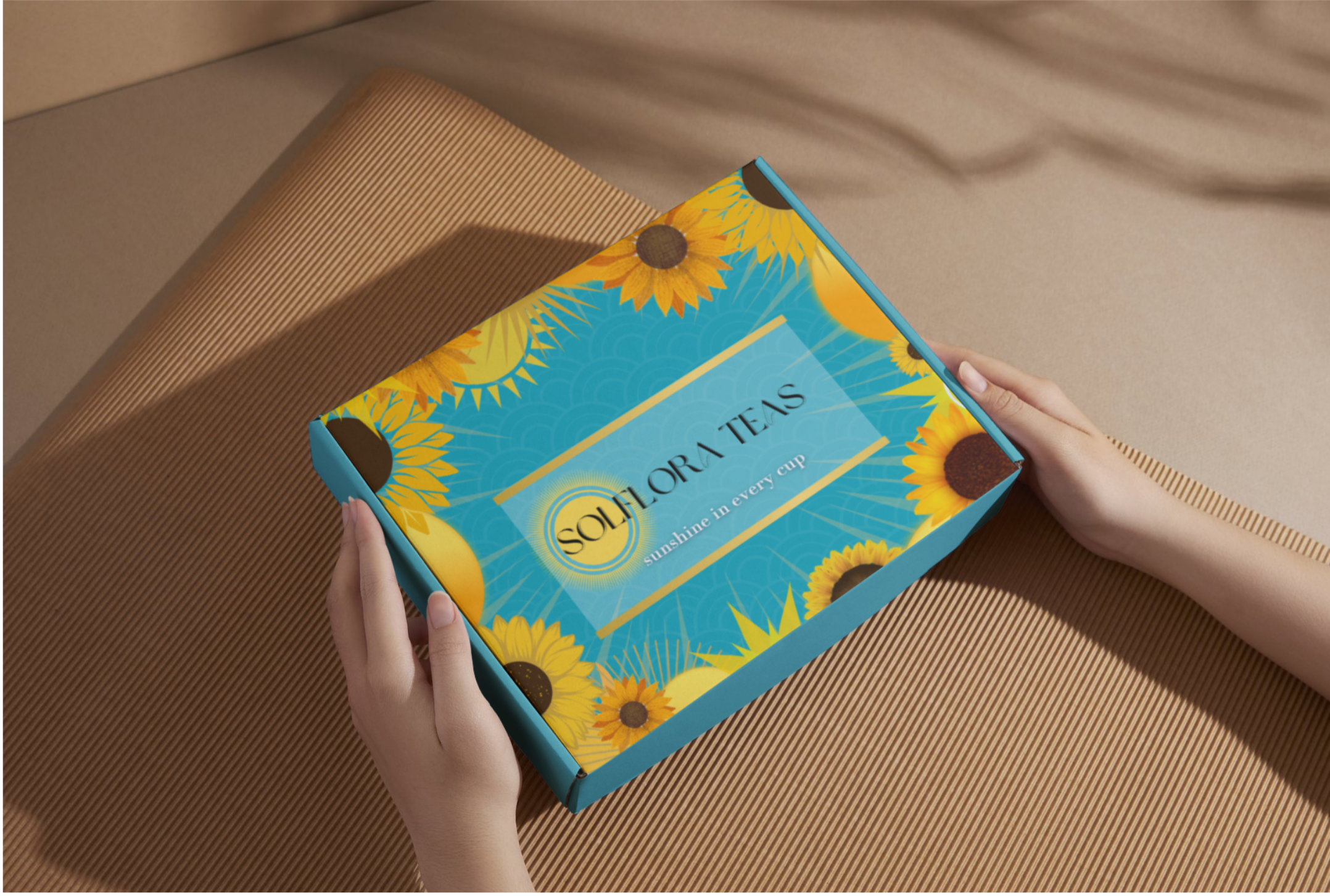
The final identity for Solflora Teas feels bright, organic, and effortlessly uplifting. The combination of sun-washed blues and golden botanicals captures the spirit of the brand — inviting customers to slow down, sip deeply, and savor life’s small joys.
From social media visuals to shelf presence, Solflora now glows with consistency and confidence, embodying its promise of “Sunshine in Every Cup.”
Reflection: Designing with Light in Mind
Solflora reminded me that joy itself can be a design language. By fusing strategic clarity with emotional storytelling, I created a brand that doesn’t just look beautiful — it feels beautiful. Every detail, from the color palette to the packaging illustrations, reflects the idea that even the smallest cup can hold a little sunlight.