ELIXIR SOCIETY | Turning Fragrance Into a Memorable Experience
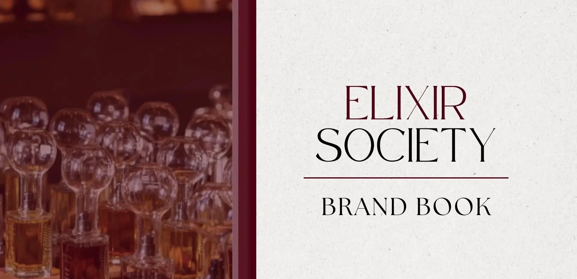
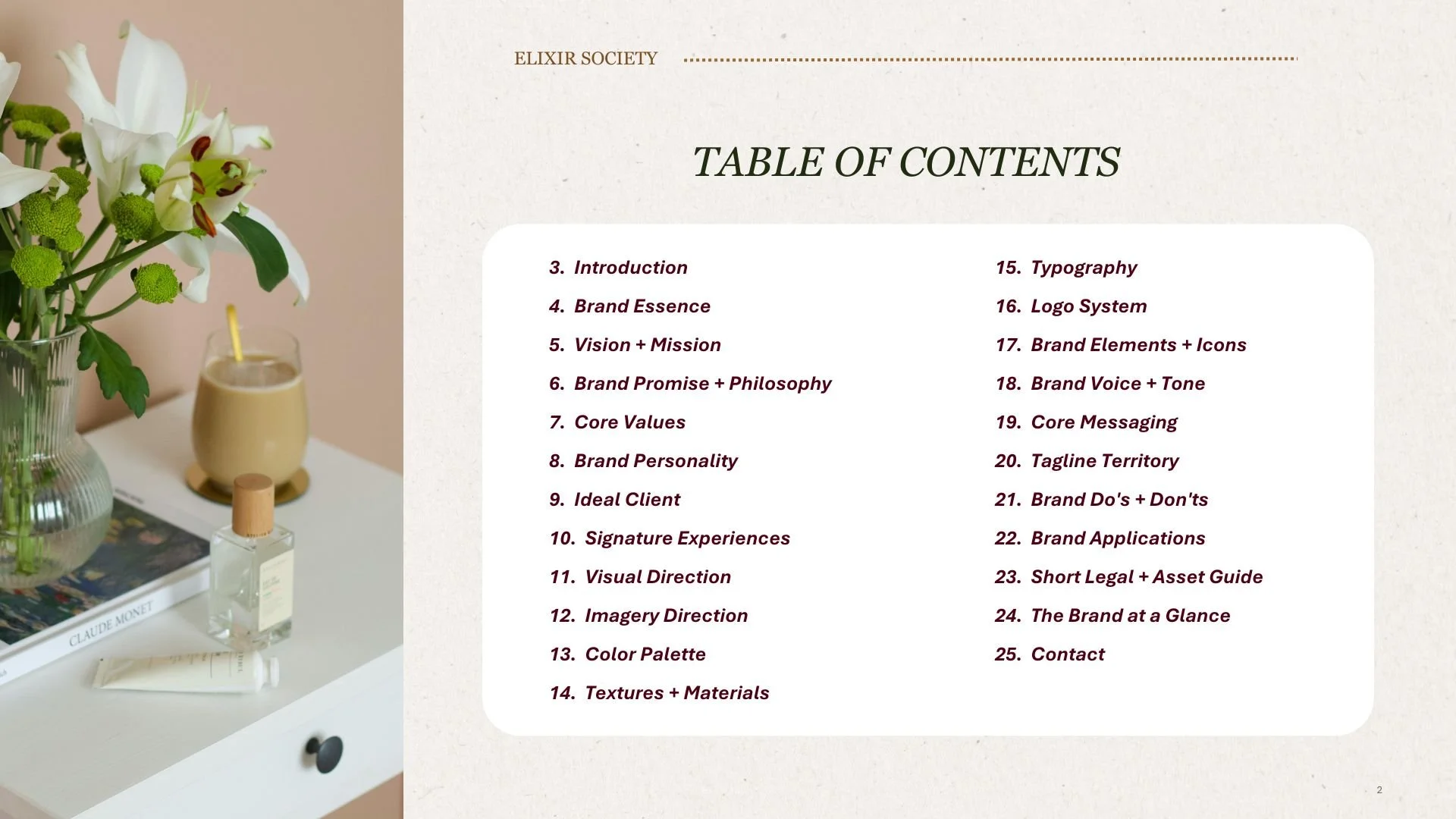
A luxury fragrance brand designed around memory, personalization, and celebration.
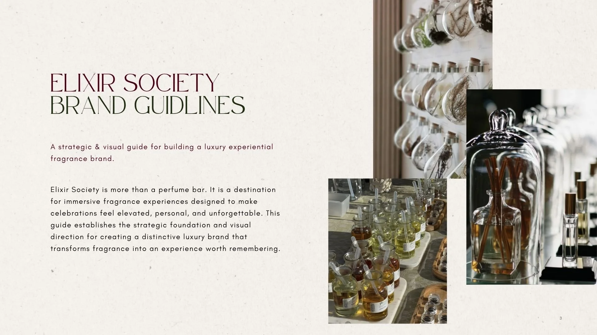
Elixir Society is more than a perfume bar. It is an immersive fragrance experience designed to make weddings, milestone celebrations, and luxury events feel more personal, elevated, and unforgettable.
The challenge was to build a visual identity that could communicate that experience before a guest ever encountered the fragrance itself.
The result is a sophisticated, romantic, and editorial brand system that transforms fragrance from a product into a meaningful part of the celebration.
THE OPPORTUNITY | MORE THAN A PERFUME BAR
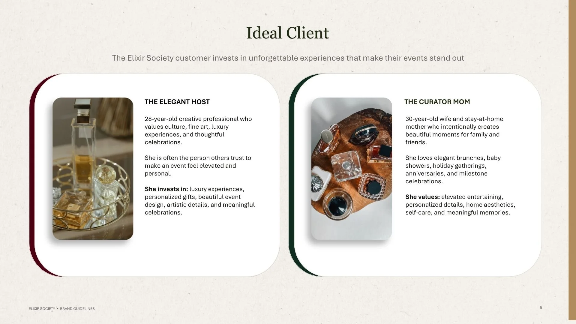
Fragrance is inherently personal. It carries memory, emotion, atmosphere, and association.
Elixir Society's opportunity was to make that emotional quality the center of the brand.
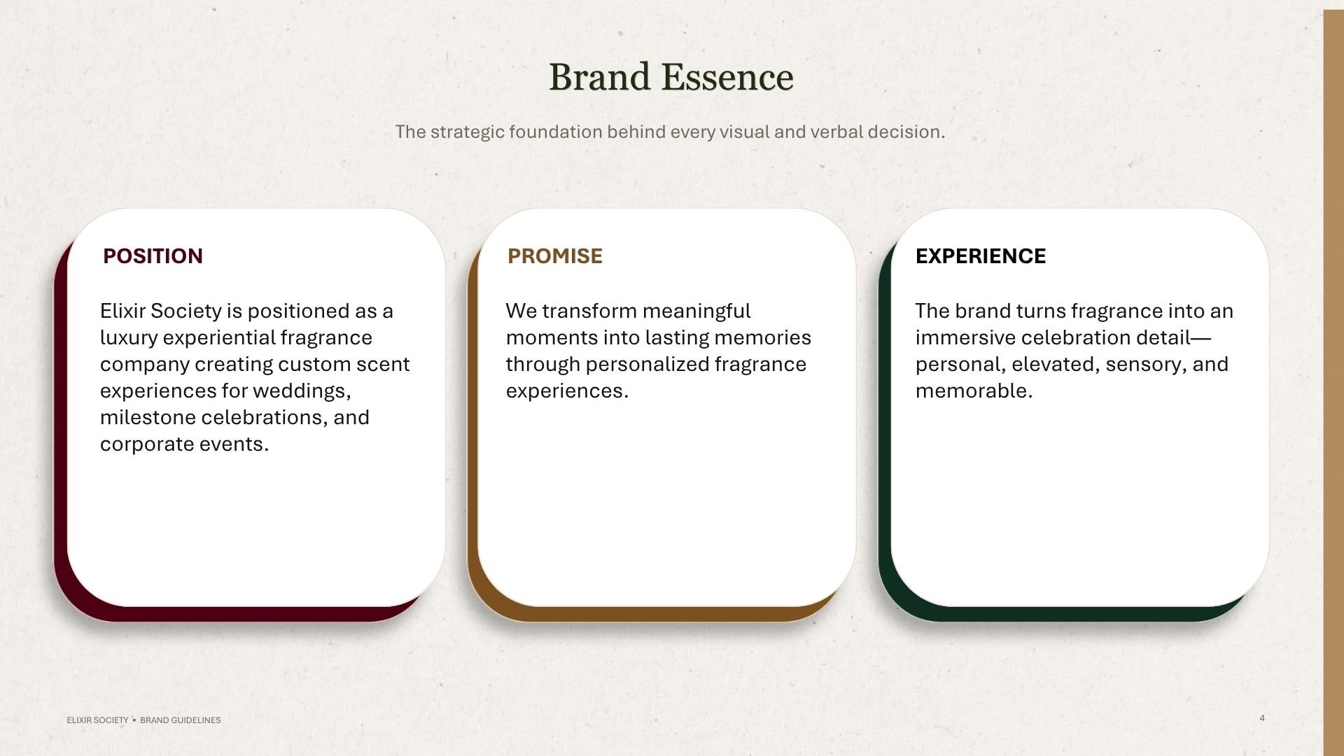
Rather than positioning the company simply as a perfume service, the brand was developed as a luxury experiential fragrance company creating custom scent experiences for weddings, milestone celebrations, and corporate events.
The strategic foundation centered on one idea:
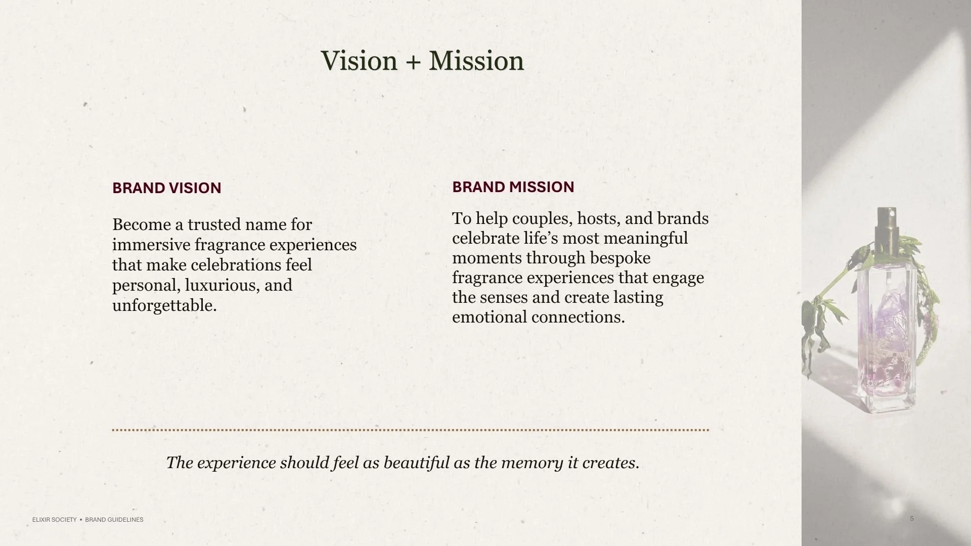
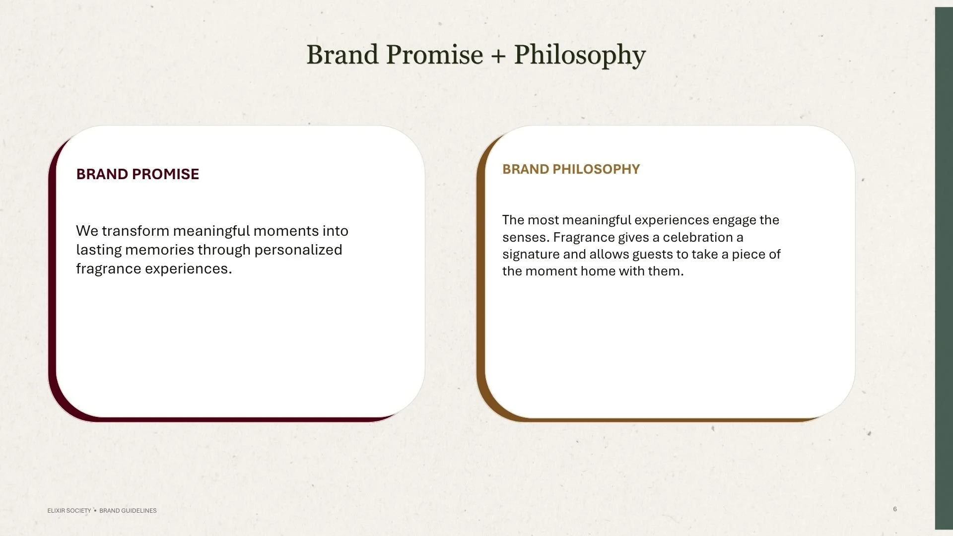
We transform meaningful moments into lasting memories through personalized fragrance experiences.
That positioning became the filter for every visual decision that followed.
THE VISION | FRAGRANCE HOUSE+MODERN BRIDAL
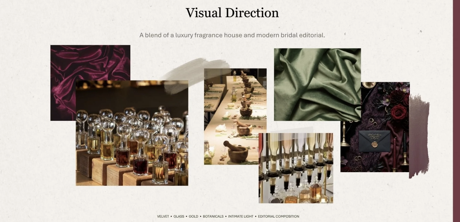
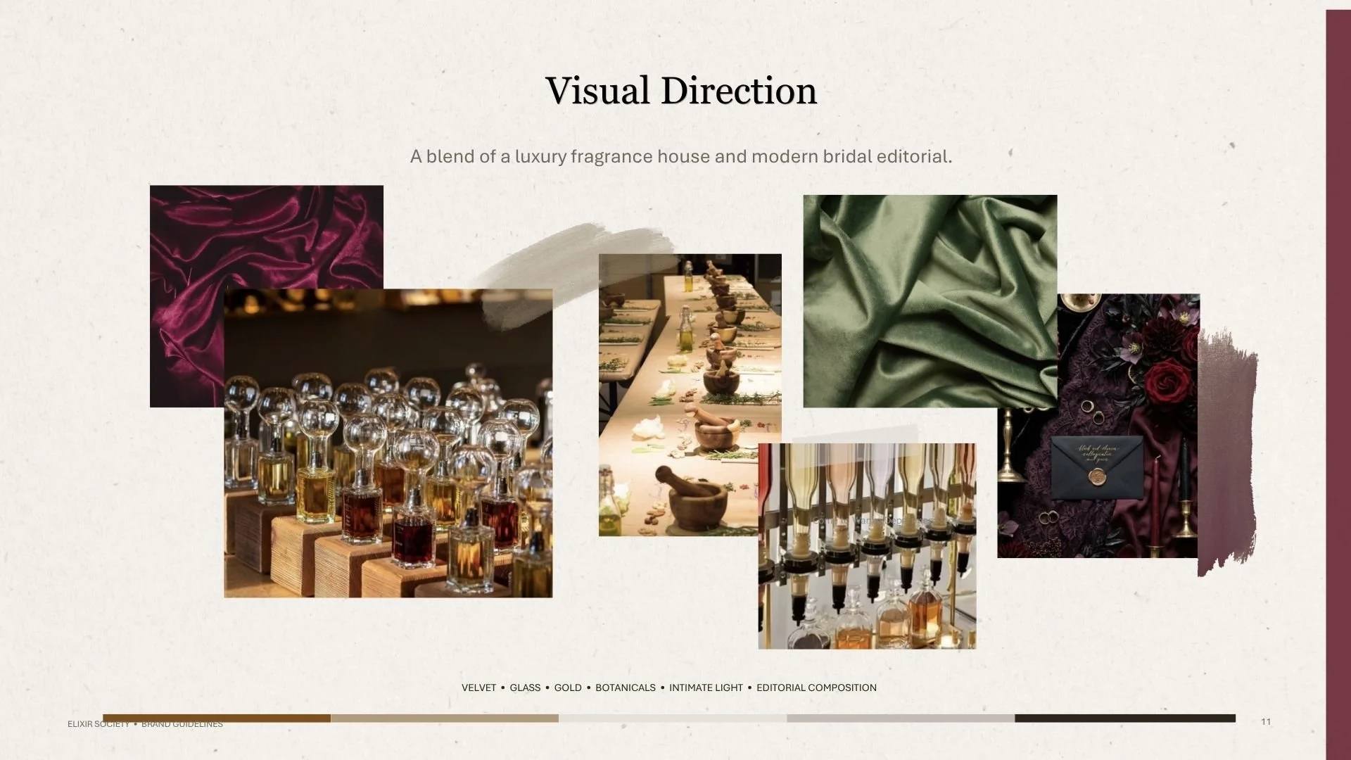
The visual direction needed to balance two worlds.
Luxury fragrance house:
Craftsmanship, premium materials, glass bottles, rich color, tactile finishes, and sophisticated presentation.
Modern bridal editorial:
Romance, intimacy, botanical details, generous whitespace, soft lighting, and a sense of occasion.
The brand book defined the visual territory as:
VELVET • GLASS • GOLD • BOTANICALS • INTIMATE LIGHT • EDITORIAL COMPOSITION
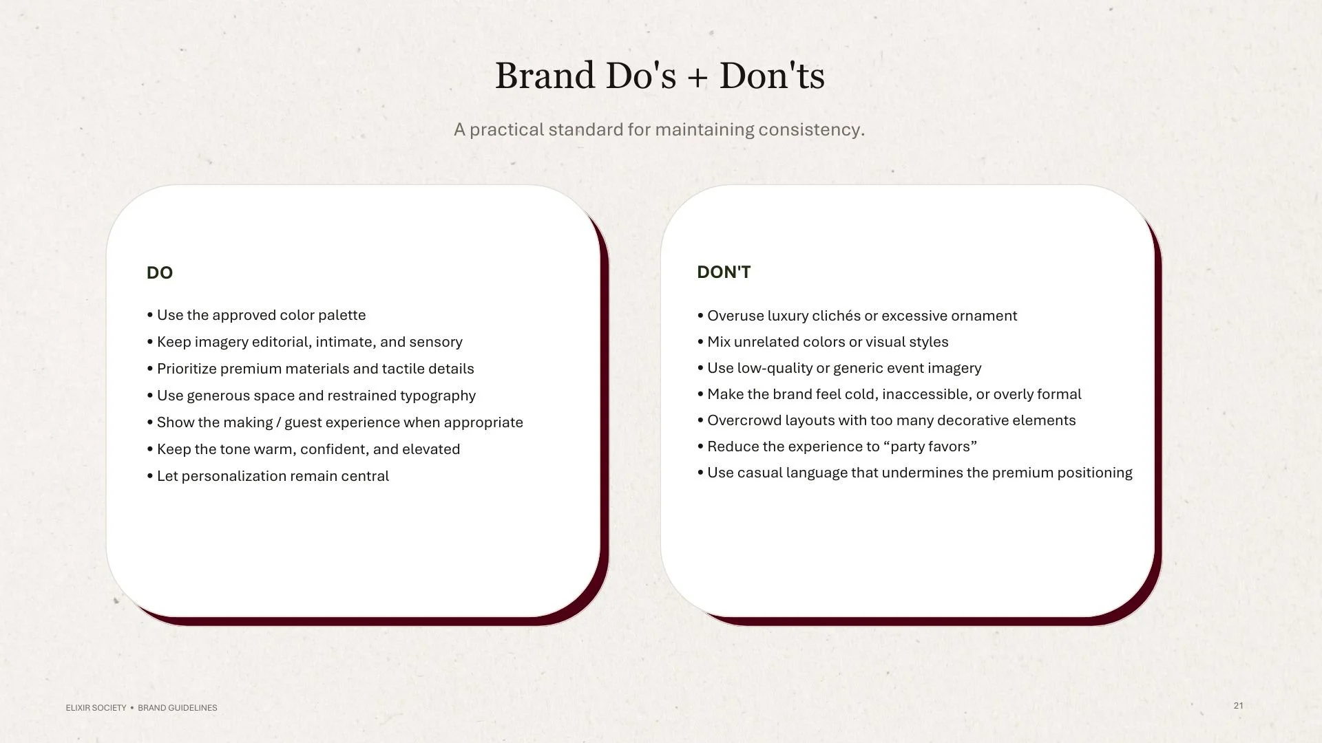
Instead of relying on conventional luxury clichés, the identity was designed to feel warm, sensory, intentional, and personal.
THE STRATEGY | DESIGNING FOR THE EXPERIENCE
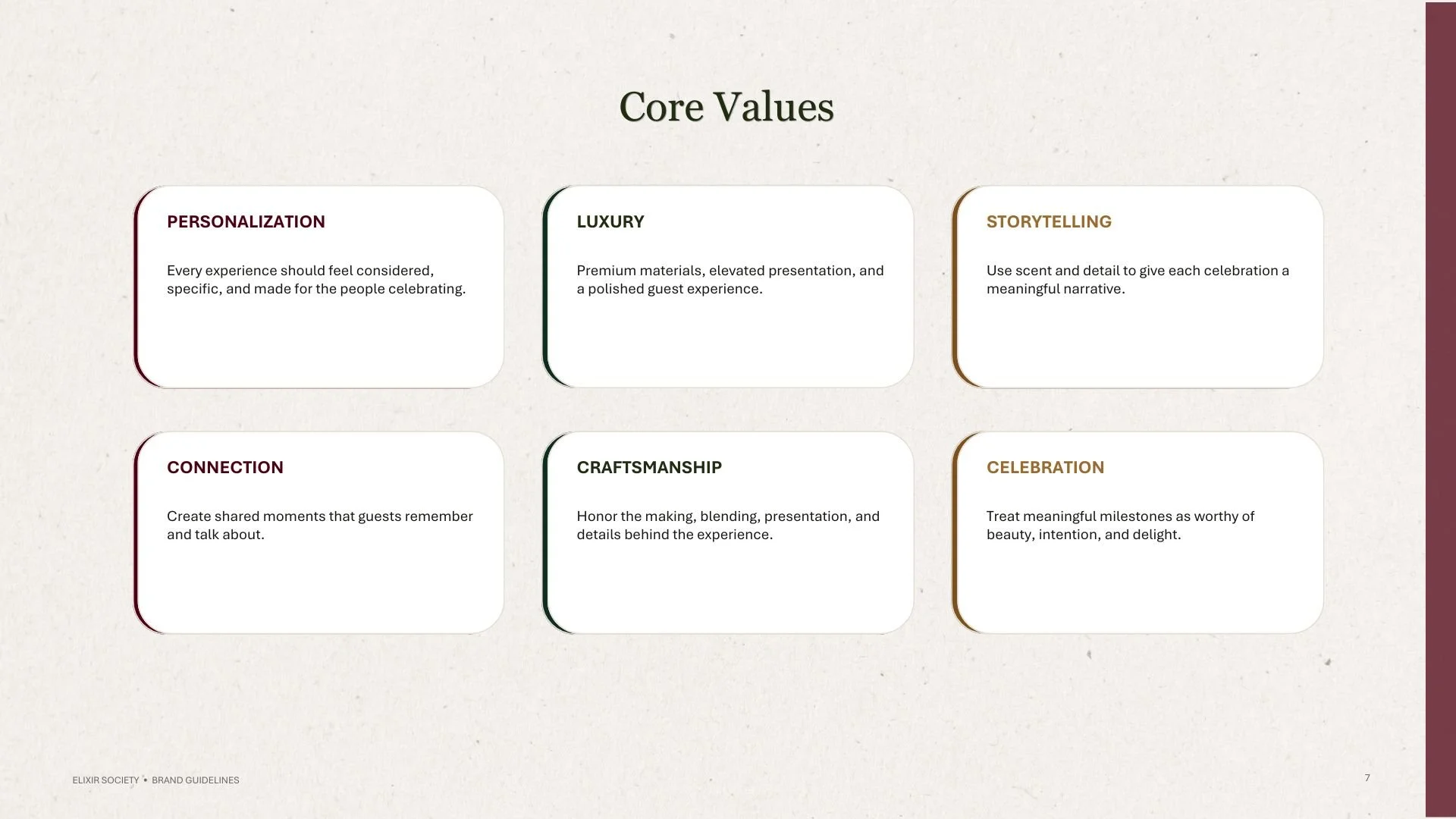
The Elixir Society brand strategy is rooted in six core values: personalization, luxury, storytelling, connection, craftsmanship, and celebration. Every touchpoint is designed to feel considered, elevated, and personal, while positioning fragrance as a meaningful part of the celebration and the memories created around it.
These values shifted the creative challenge from “How should a perfume brand look?” to “How should a memorable fragrance experience feel?” That distinction became the foundation for the brand’s visual identity, shaping everything from its aesthetic direction to its materials, presentation, and storytelling.
THE LOGO EXPLORATION | FROM INITIALS TO ICON
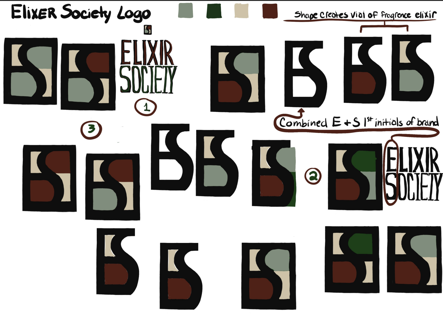
The logo exploration began by looking at the relationship between E + S, the initials of Elixir Society.
Rather than treating the initials as a simple monogram, the exploration investigated how the letterforms could become a recognizable symbol in their own right.
The key concept was shape as vessel: forms inspired by the silhouette and structure of a fragrance vial were combined with the E and S to create a mark that could function as both identity and object.
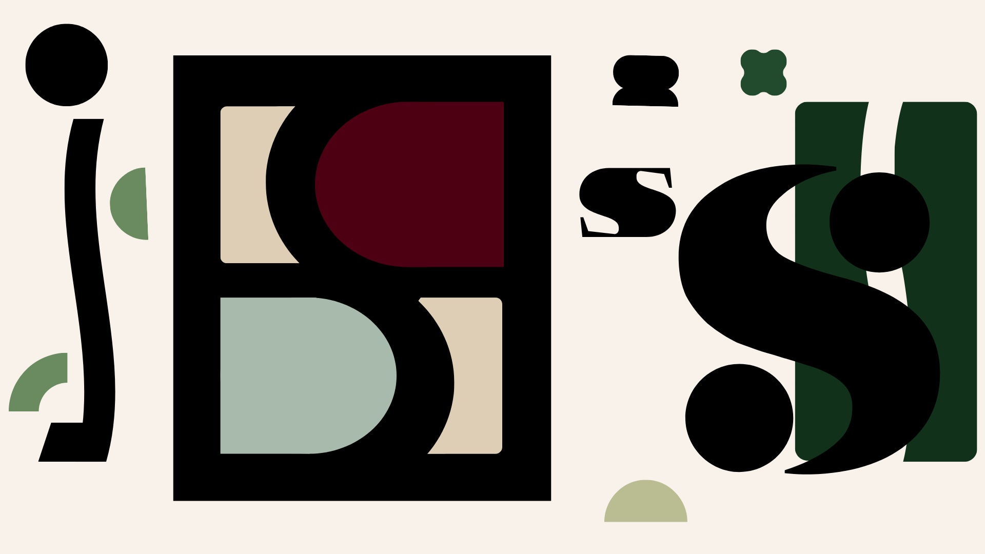
The exploration moved through several configurations, testing:
E + S combinations
stacked monograms
geometric framing
color-blocked forms
simplified bottle-inspired shapes
primary and secondary logo arrangements
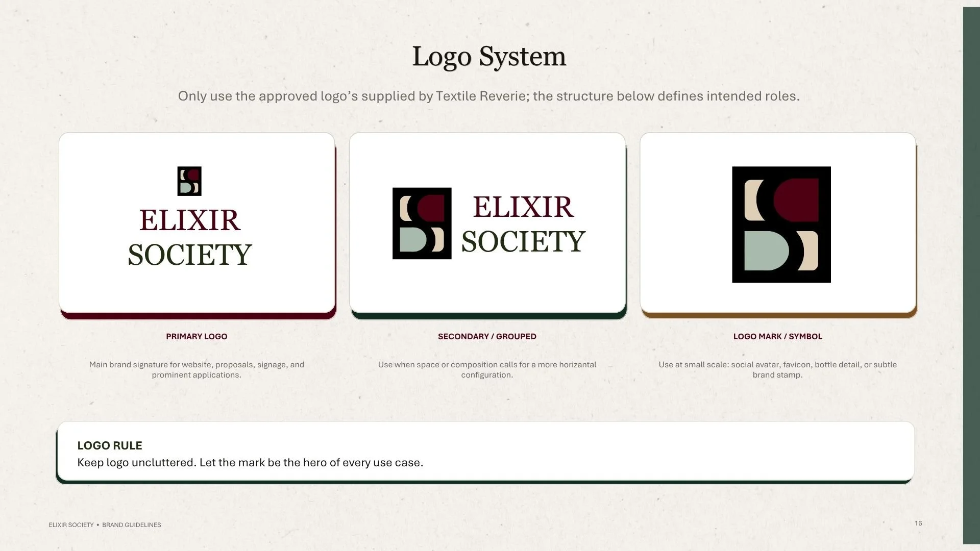
This process ultimately established a flexible logo system rather than a single logo.
The approved system includes a primary logo, a secondary/grouped configuration, and a logo mark/symbol for smaller applications such as social avatars, bottle details, favicons, and subtle brand stamps.
THE KEY DESIGN PRINCIPLE
Keep the logo uncluttered. Let the mark be the hero.
This became especially important as the identity moved from a brand guideline into physical and digital applications.
THE COLOR SYSTEM | EARTHY, ROMANTIC, ELEVATED
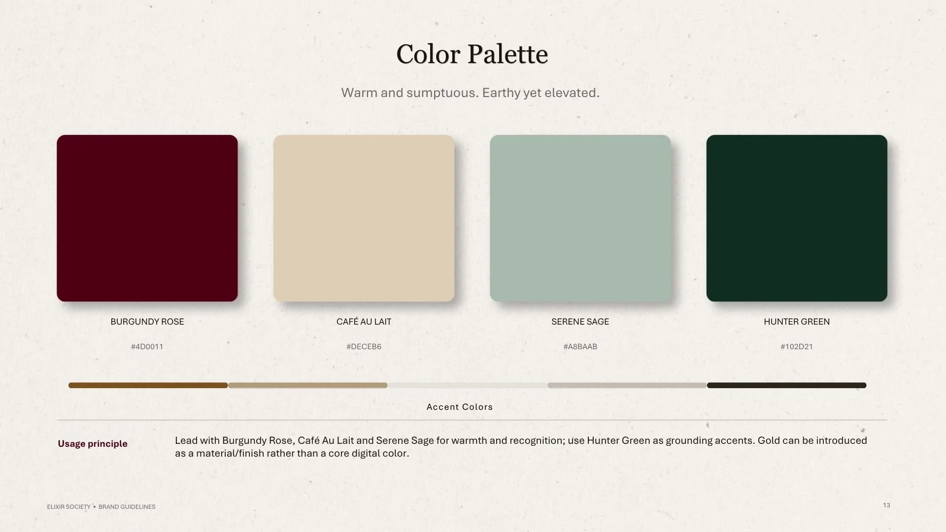
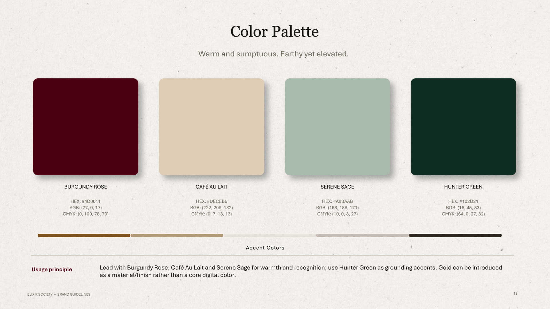
The palette was designed to feel sumptuous without becoming overly traditional.
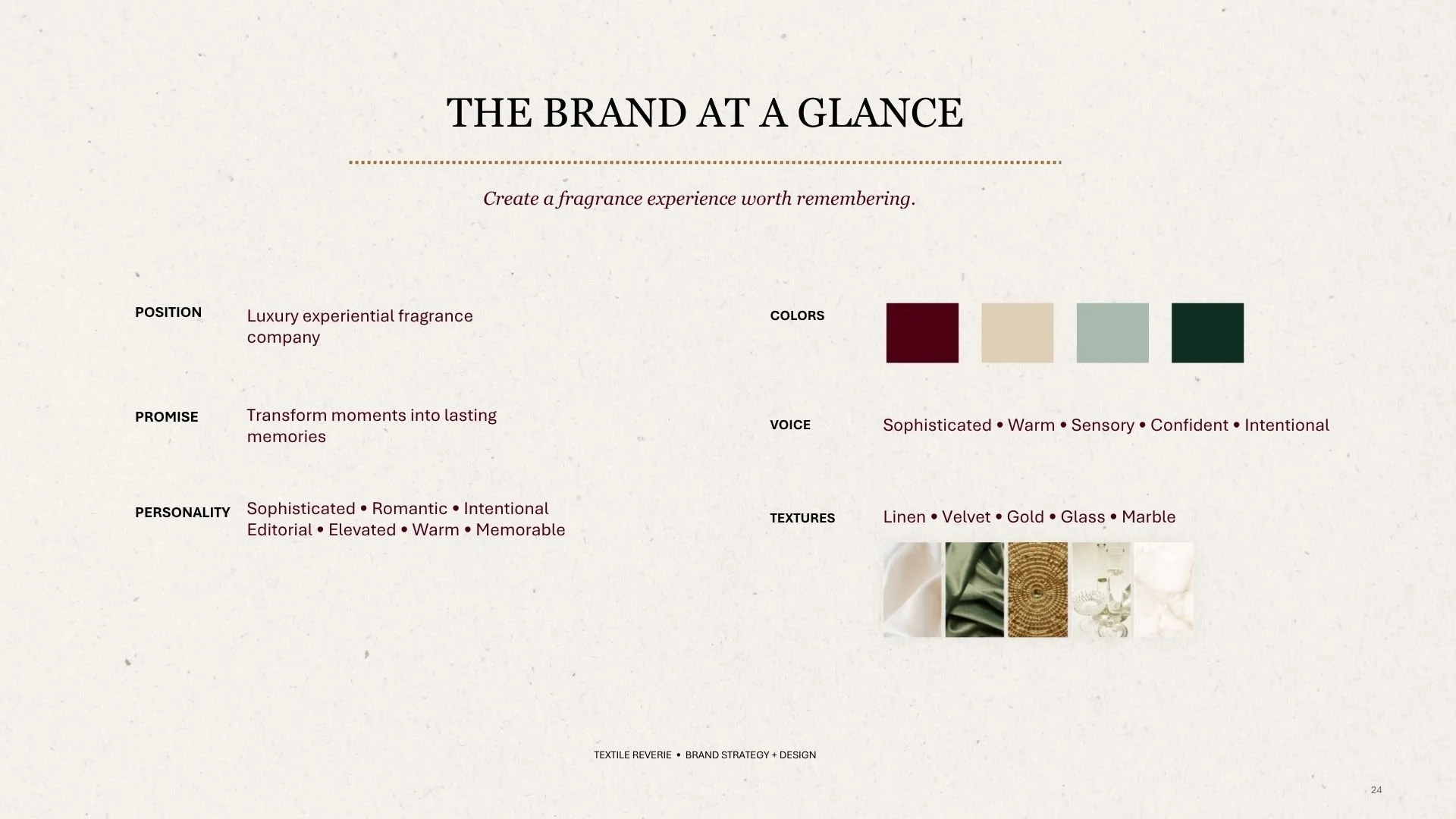
BURGUNDY ROSE -The emotional anchor of the identity. Rich, romantic, dramatic, and celebratory.
CAFÉ AU LAIT- A warm neutral that creates softness and gives the brand an editorial, tactile quality.
HUNTER GREEN - The grounding color. Deep, sophisticated, and connected to the botanical side of the visual language.
SERENE SAGE - A softer botanical counterpoint that introduces freshness and balance.
GOLD - Used primarily as a material and finish, rather than a core digital color.
The palette intentionally leads with Burgundy Rose, Café Au Lait, and Serene Sage, while Hunter Green provides grounding contrast.
THE TYPOGRAPHY | EDITORIAL + ACCESSIBLE
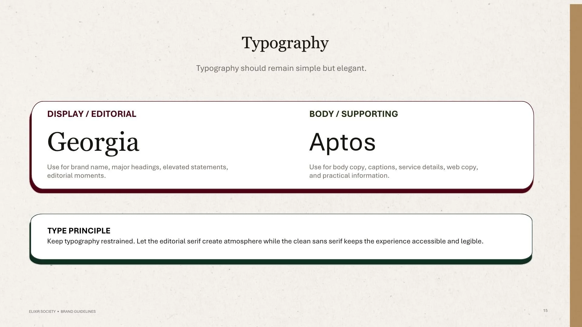
Typography was deliberately restrained.
Georgia establishes the editorial voice through the brand name, major headings, and elevated statements.
Aptos provides a clean supporting system for practical information, captions, service descriptions, and digital content.
The contrast creates the same balance found throughout the brand:
romantic + practical
luxurious + approachable
editorial + accessible
THE VISUAL LANGUAGE | MAKING THE SENSORY TANGIBLE
The identity needed to work beyond a logo.
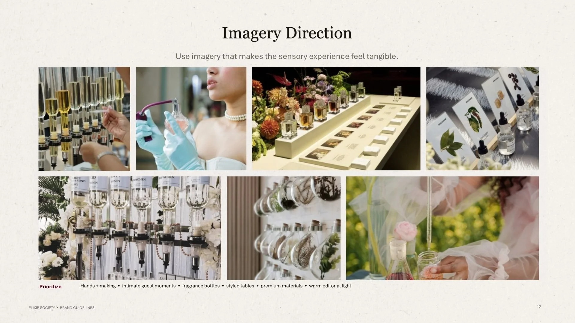
Imagery was therefore directed toward the details guests actually experience:
hands + making • intimate guest moments • fragrance bottles • styled tables • premium materials • warm editorial light
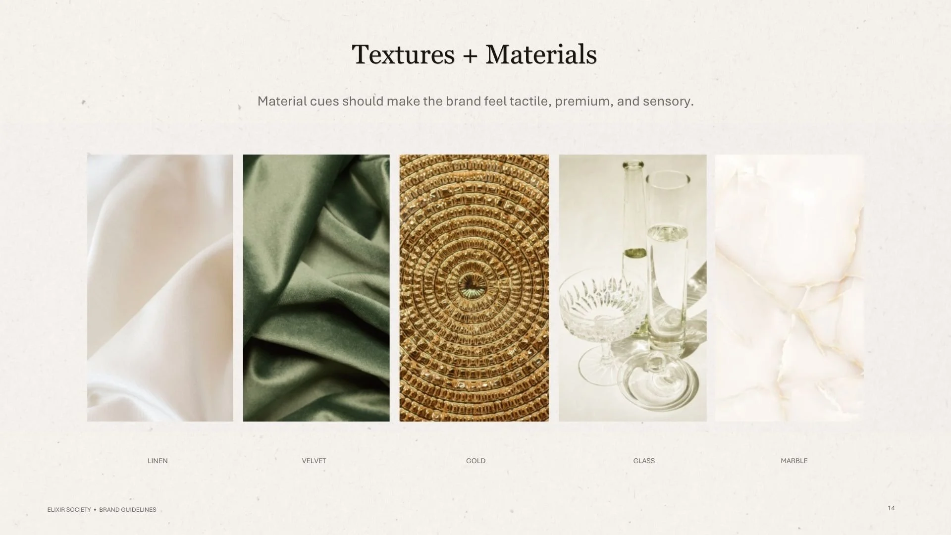
Materiality became an important part of the system:
LINEN • VELVET • GOLD • GLASS • MARBLE
These materials give the identity a tactile quality and reinforce the idea that Elixir Society is an experience to be seen, touched, smelled, and remembered.
THE BRAND SYSTEM | DESIGNED TO SCALE
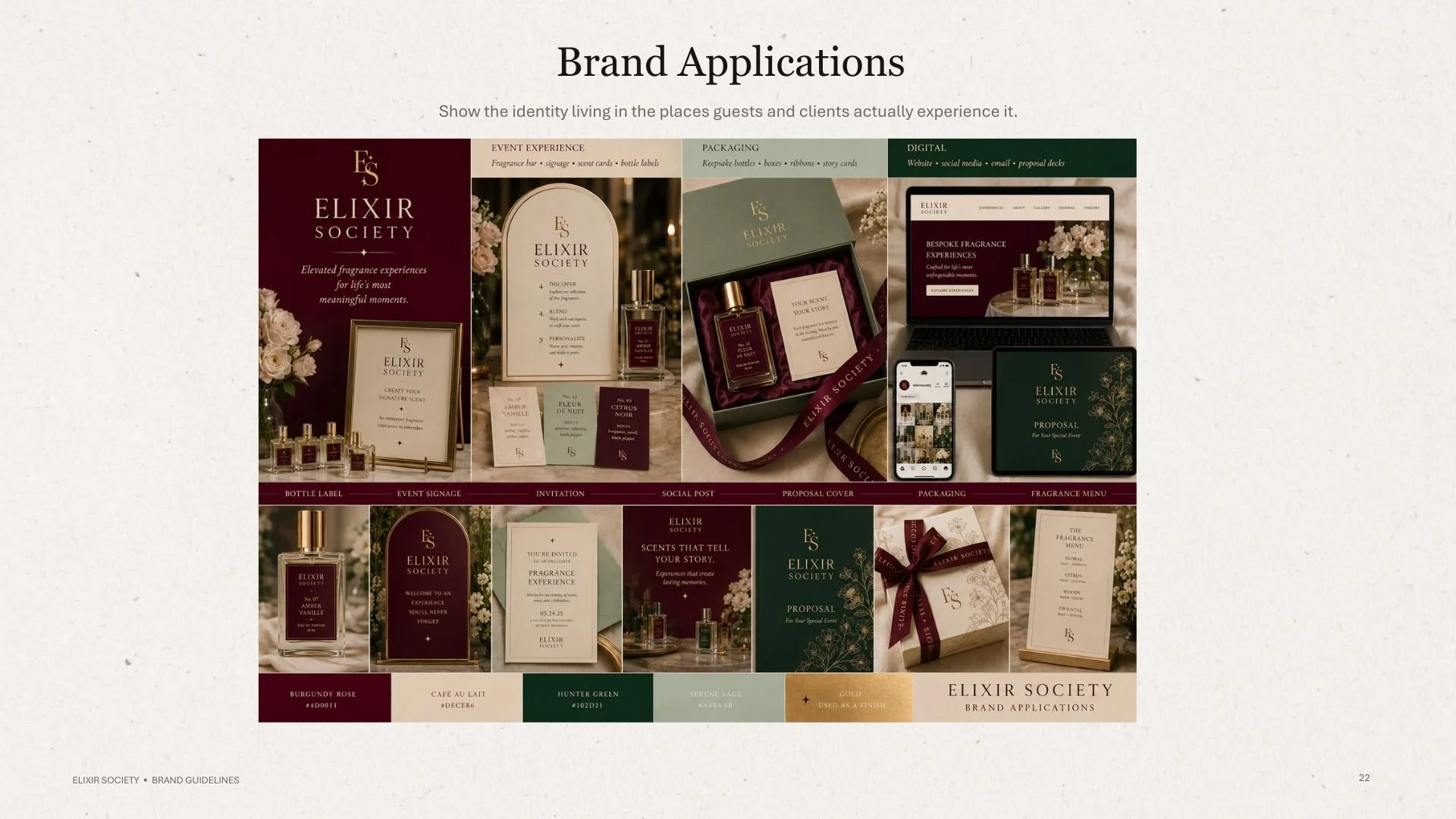
One of the most important goals was creating an identity that could move seamlessly between different environments. This required thinking beyond individual pieces and creating a visual language that could remain recognizable across every touchpoint.
The system was designed for:
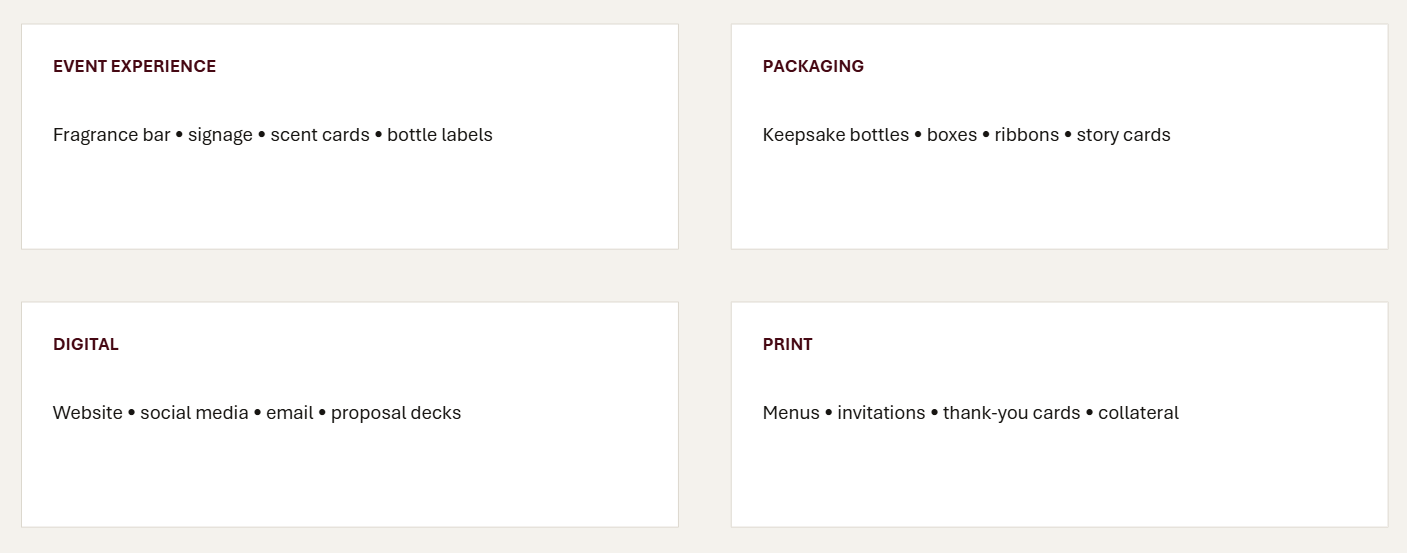
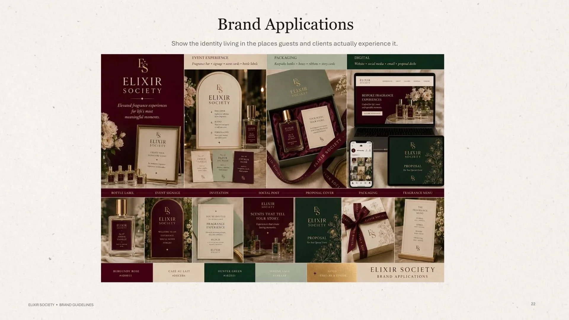
THE APPLICATIONS | FROM IDENTITY TO EXPERIENCE
The Elixir Society brand strategy is rooted in six core values: personalization, luxury, storytelling, connection, craftsmanship, and celebration. Every touchpoint is designed to feel considered, elevated, and personal, while positioning fragrance as a meaningful part of the celebration and the memories created around it.
These values shifted the creative challenge from “How should a perfume brand look?” to “How should a memorable fragrance experience feel?” That distinction became the foundation for the brand’s visual identity, shaping everything from its aesthetic direction to its materials, presentation, and storytelling
THE EXPERIENCE | CURATED CUSTOMER MOMENTS
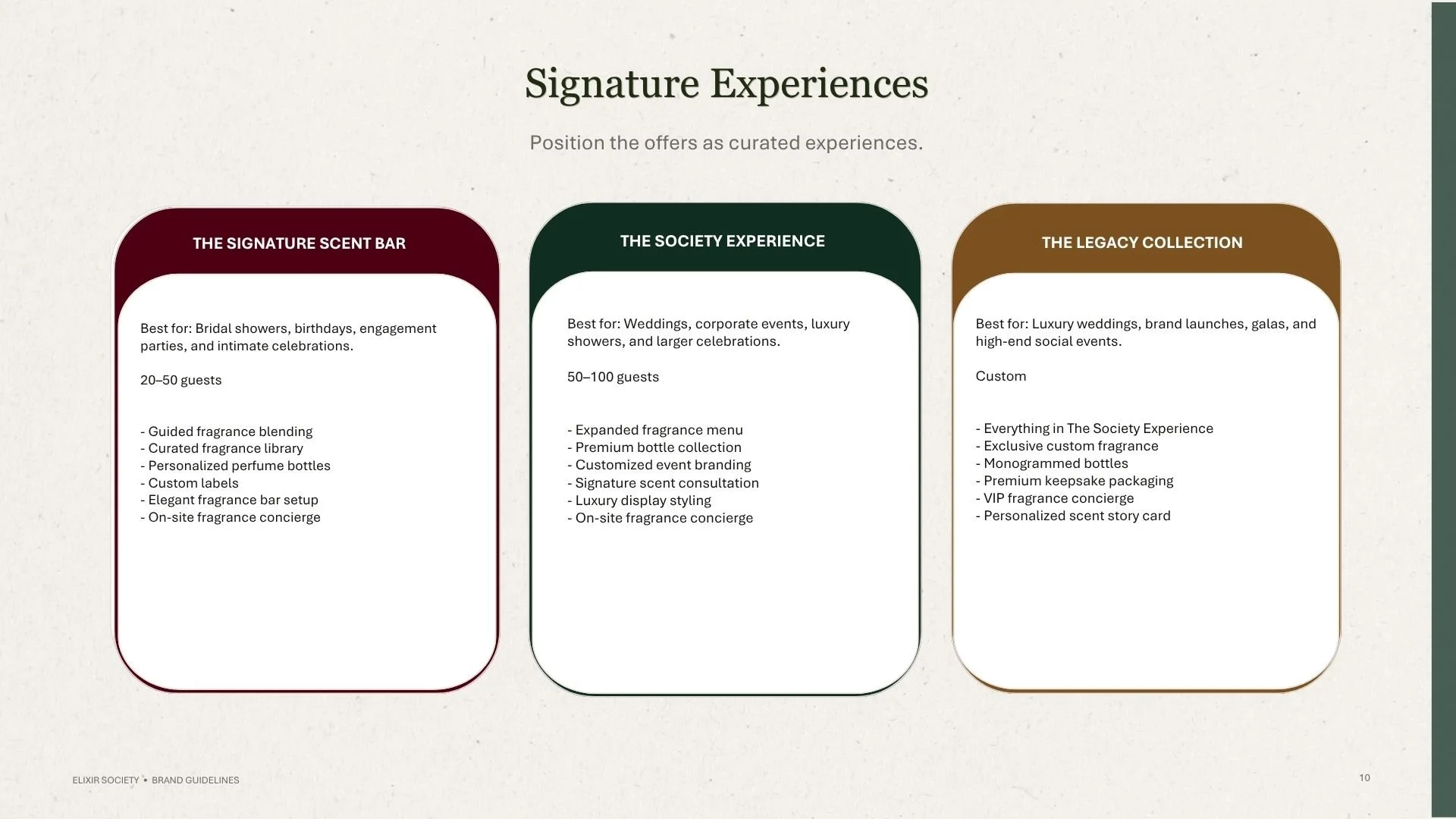
Elixir Society's signature offerings are structured as curated experiences rather than products.
The Signature Scent Bar introduces guided fragrance blending, personalized bottles, custom labels, and an elegant fragrance bar setup.
The Society Experience expands the concept for weddings, corporate events, and larger celebrations.
The Legacy Collection takes the experience further through exclusive custom fragrance, monogrammed bottles, premium keepsake packaging, VIP concierge service, and personalized scent story cards.
The identity needed to support all three tiers without losing its sense of intimacy.
THE OUTCOME | A BRAND BUILT FOR MEMORY
The final brand system positions Elixir Society as a luxury experiential fragrance company, rather than simply a perfume vendor.
The result is an identity that connects:
STRATEGY
Positioning, audience, values, messaging, and experience architecture.
IDENTITY
Logo system, color palette, typography, visual elements, and art direction.
EXPERIENCE
Packaging, signage, fragrance menus, invitations, digital touchpoints, and client-facing materials.
STORYTELLING
A consistent visual and verbal language built around personalization, sensory experience, celebration, and memory.
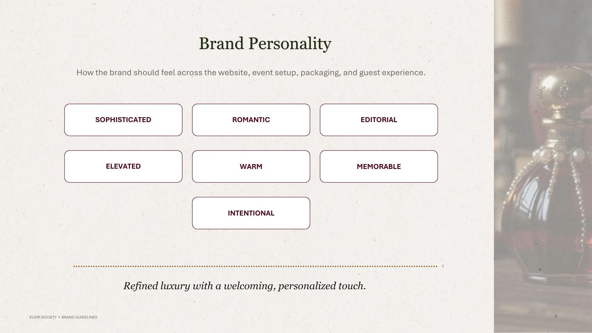
The brand personality ultimately comes through as:
SOPHISTICATED • ROMANTIC • INTENTIONAL • EDITORIAL • ELEVATED • WARM • MEMORABLE
MY ROLE | STRATEGY + DESIGN
For this project, my work bridged brand strategy and visual execution.
I developed the strategic and visual framework for the brand, including:
Brand positioning and essence
Vision and mission
Brand promise and philosophy
Core values
Audience definition
Experience architecture
Visual direction
Logo exploration and logo system
Color palette
Typography system
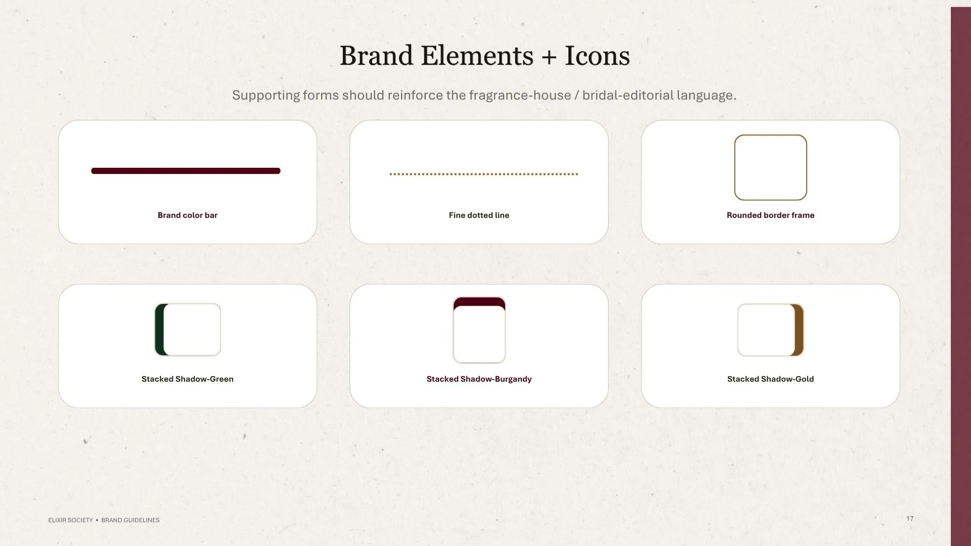
Brand elements and icons
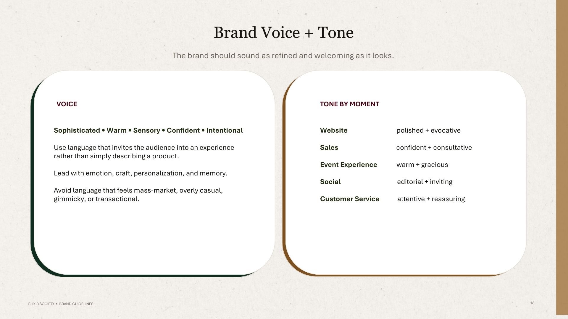
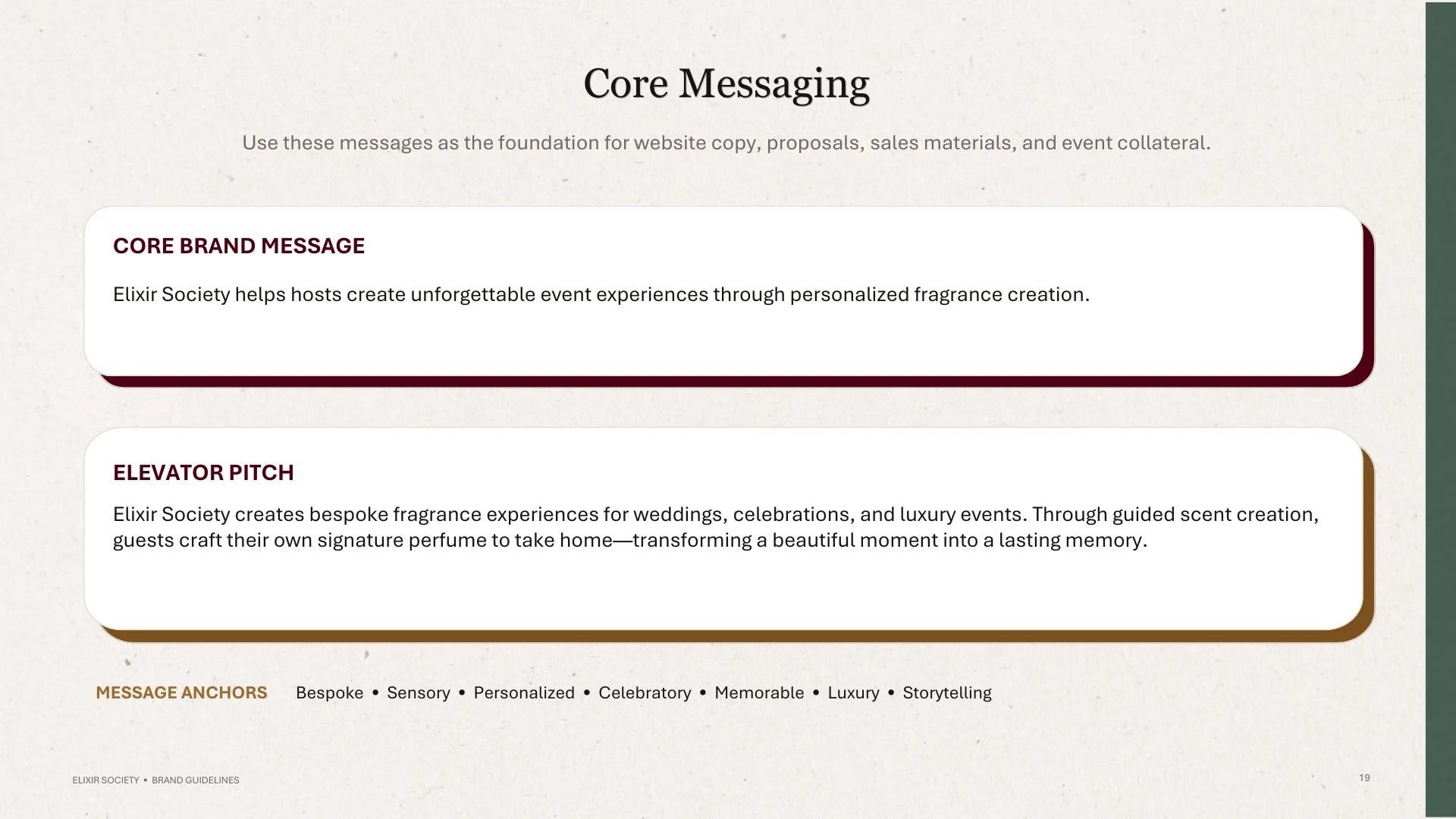
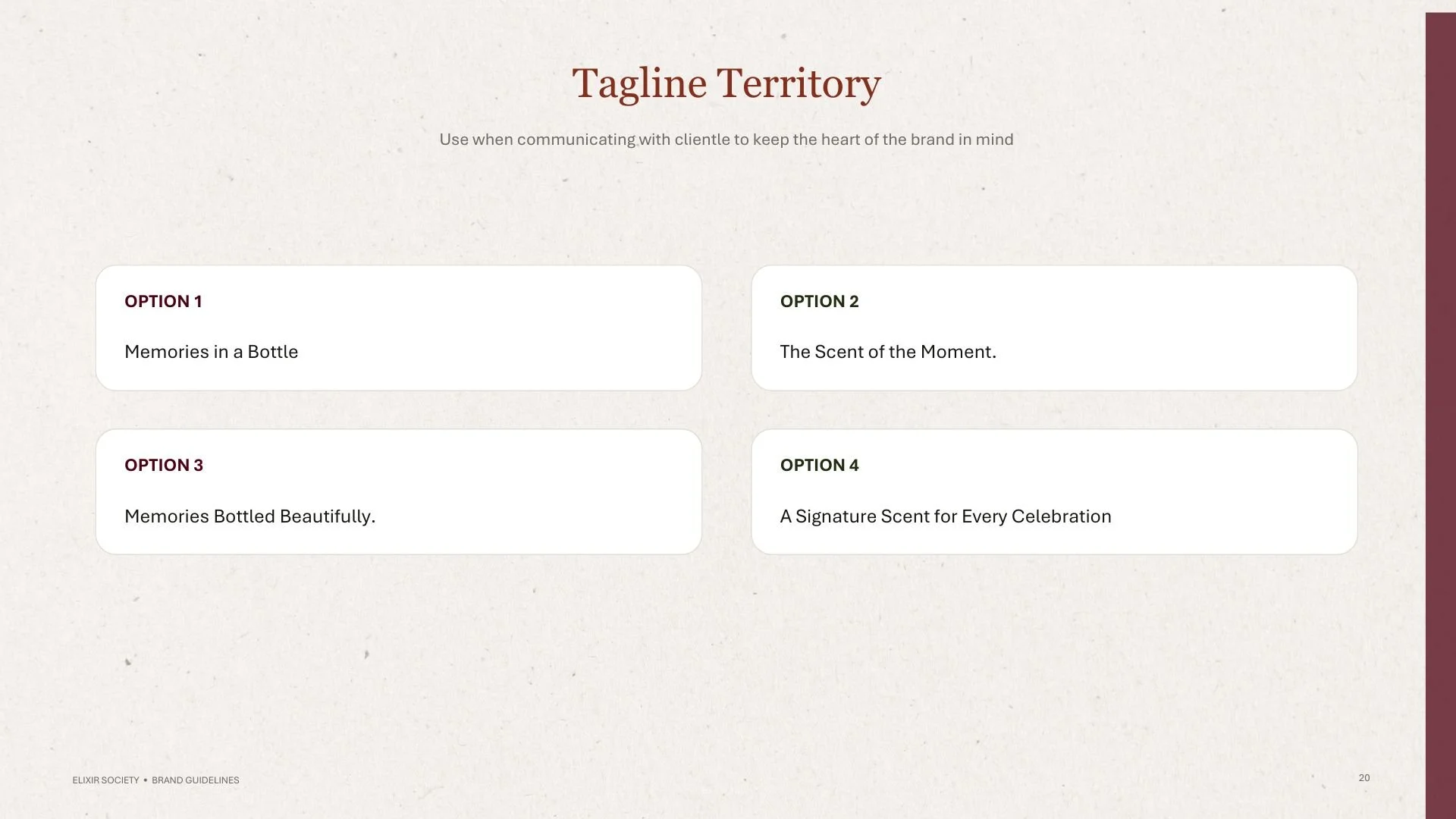
Voice and messaging direction
Brand applications
Brand guideline structure and editorial layout
The result demonstrates my approach to brand design: strategy first, aesthetics with intention, and systems built to work in the real world.
THE TAKEAWAY | DESIGNING FOR THE EXPERIENCE
The strongest brand identities do more than look beautiful.
They give people a reason to remember you.
For Elixir Society, the goal was to make the visual identity feel like the experience itself: personal, sensory, refined, romantic, and worth remembering.
The final system creates a foundation that can move from a bottle label to a luxury event, from a proposal deck to a keepsake box, while maintaining one recognizable point of view.
It’s more than a fragrance. It’s a lasting memory.
SERVICES
Looking for a designer who can connect strategy, storytelling, and visual identity?
I help lifestyle, beauty, hospitality, fashion, and experience-driven brands turn ideas into cohesive identities and meaningful brand experiences.
