Case In Point | Modern Minimal Presentation Design



Overview
This project involved designing a clean, professional presentation deck for a business case study. The goal was to communicate a narrative clearly—moving from context to conflict, and finally to actionable insights—while maintaining strong visual consistency and audience engagement.
Challenge
The main challenge was balancing clarity with visual interest. The content needed to feel structured and impactful, without overwhelming the audience with text-heavy slides. Each section also needed to transition smoothly to support storytelling flow.
Approach
A minimal, modular layout system was used across all slides. The design relied on a soft teal-and-white color palette, ample whitespace, and consistent geometric accents to create cohesion. Key sections were structured as:
Case in Point: A strong opening slide to establish context
The Case: A narrative introduction with supporting detail
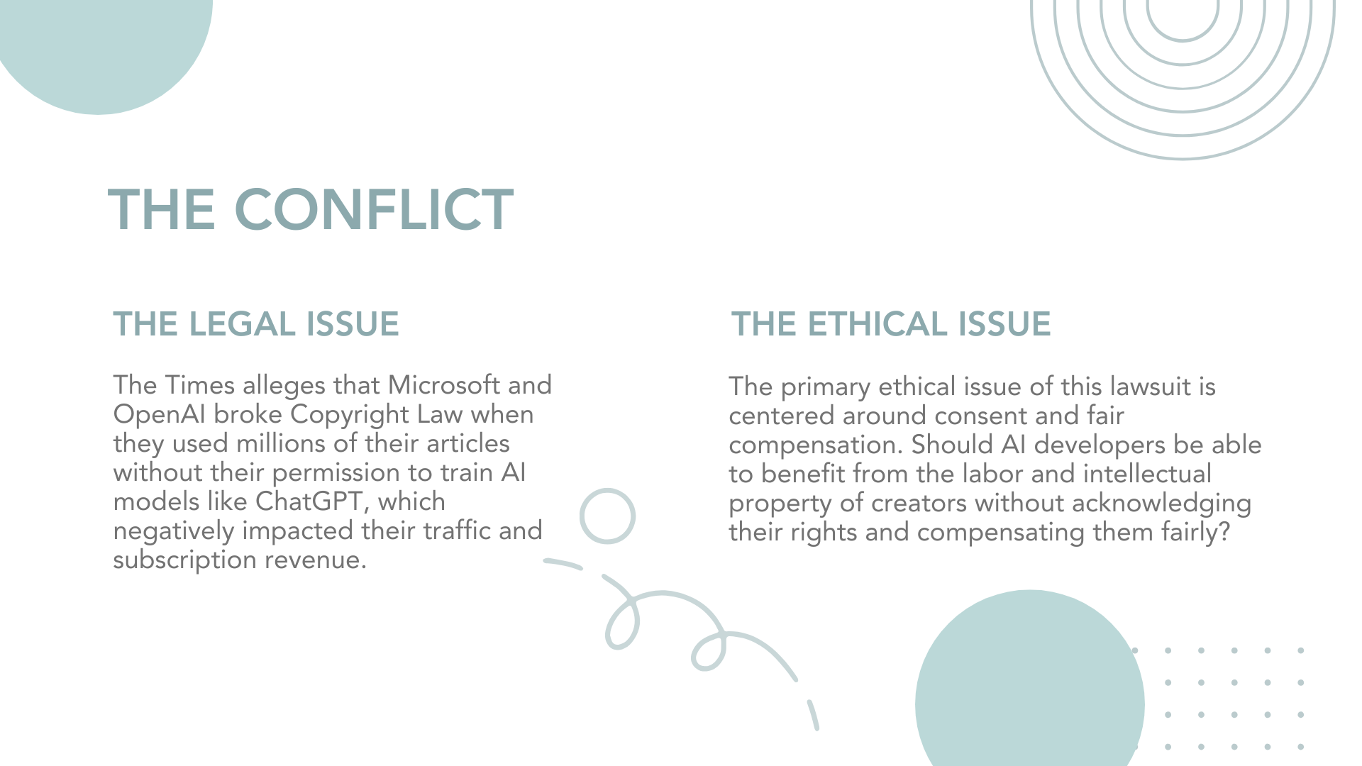
The Conflict: A focused breakdown of the core problem
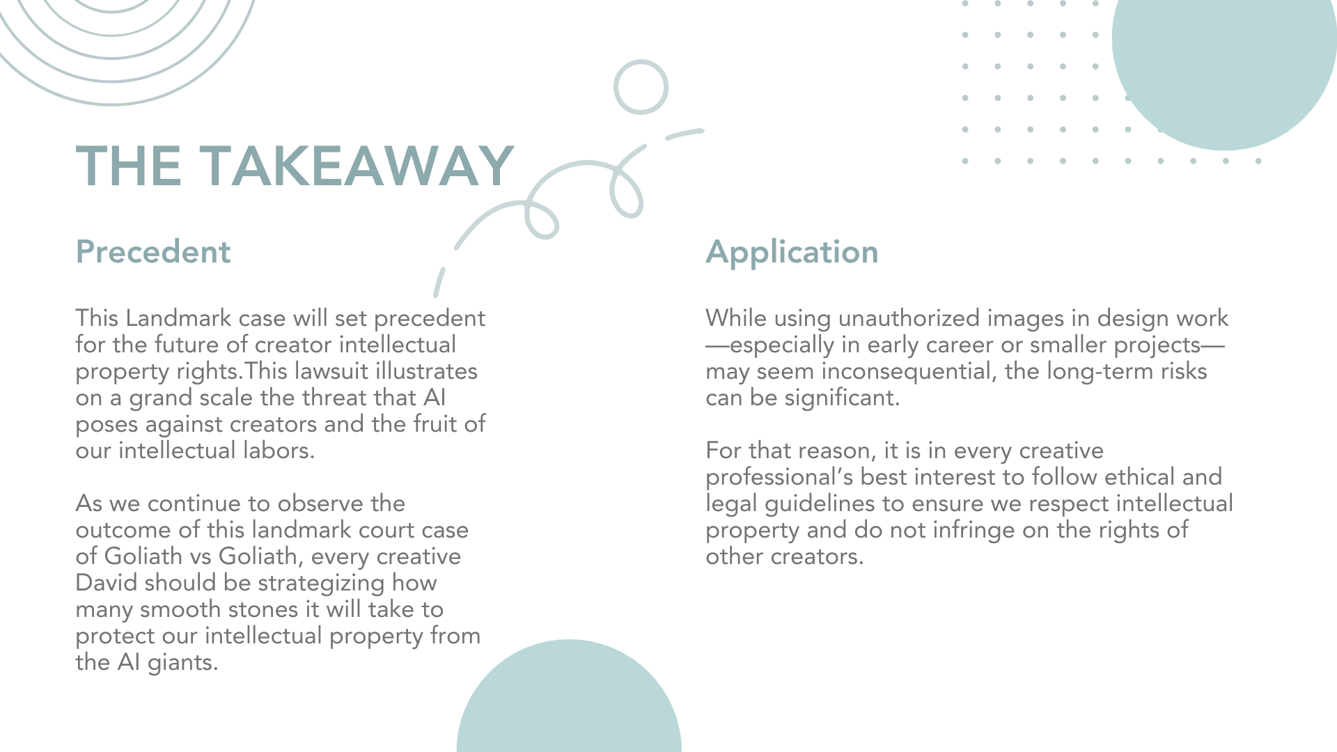
The Takeaway: Clear insights and resolution
Thank You: A simple closing slide for polish and closure
Typography was kept clean and modern, with clear hierarchy guiding attention through headings and body text.
Outcome
The final presentation delivers a polished, executive-level experience that improves readability and storytelling flow. The consistent visual language helps the audience quickly understand the narrative while maintaining engagement throughout the deck.
