10 Strategies | Redesigning a Book Cover to Be Clear and On Target
“The new 10 Strategies cover transforms a practical career guide into a visual metaphor for focus, momentum, and self-discovery—a modern symbol for finding your true direction.”
The Brief | A Visual Compass for Career Seekers
The second edition of 10 Strategies to Choose the Right Career Path called for more than an update—it needed a visual identity that spoke to a new generation of readers: college students, early-career professionals, and career-changers (ages 18–34).
Our goal was to design a cover that reflects both clarity and movement—a modern invitation to align one’s work with purpose.
The redesign had to communicate three things instantly:
1. Professional credibility
2. Personal growth
3. Forward direction
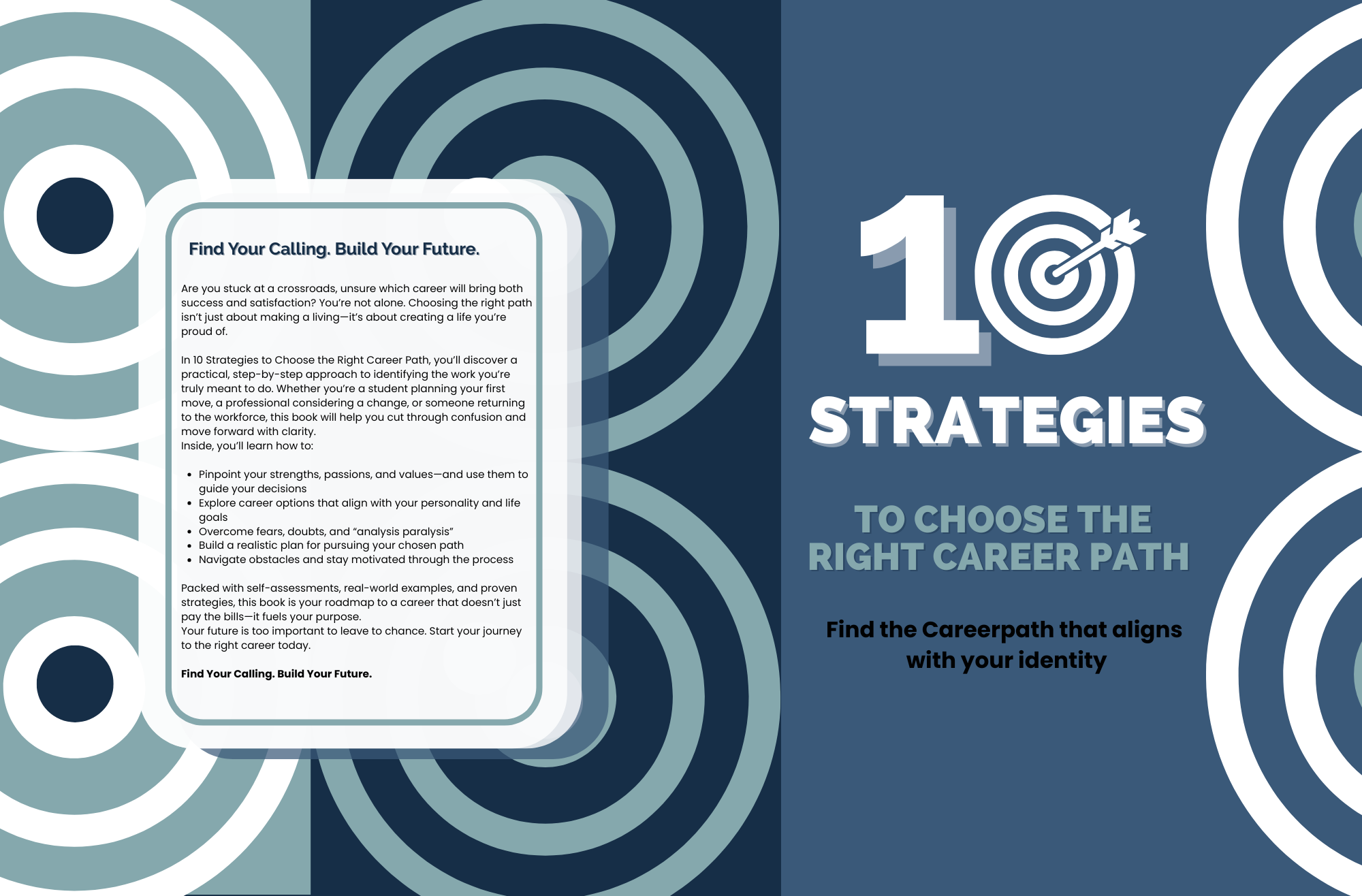
The Vision | The Bullseye as Metaphor
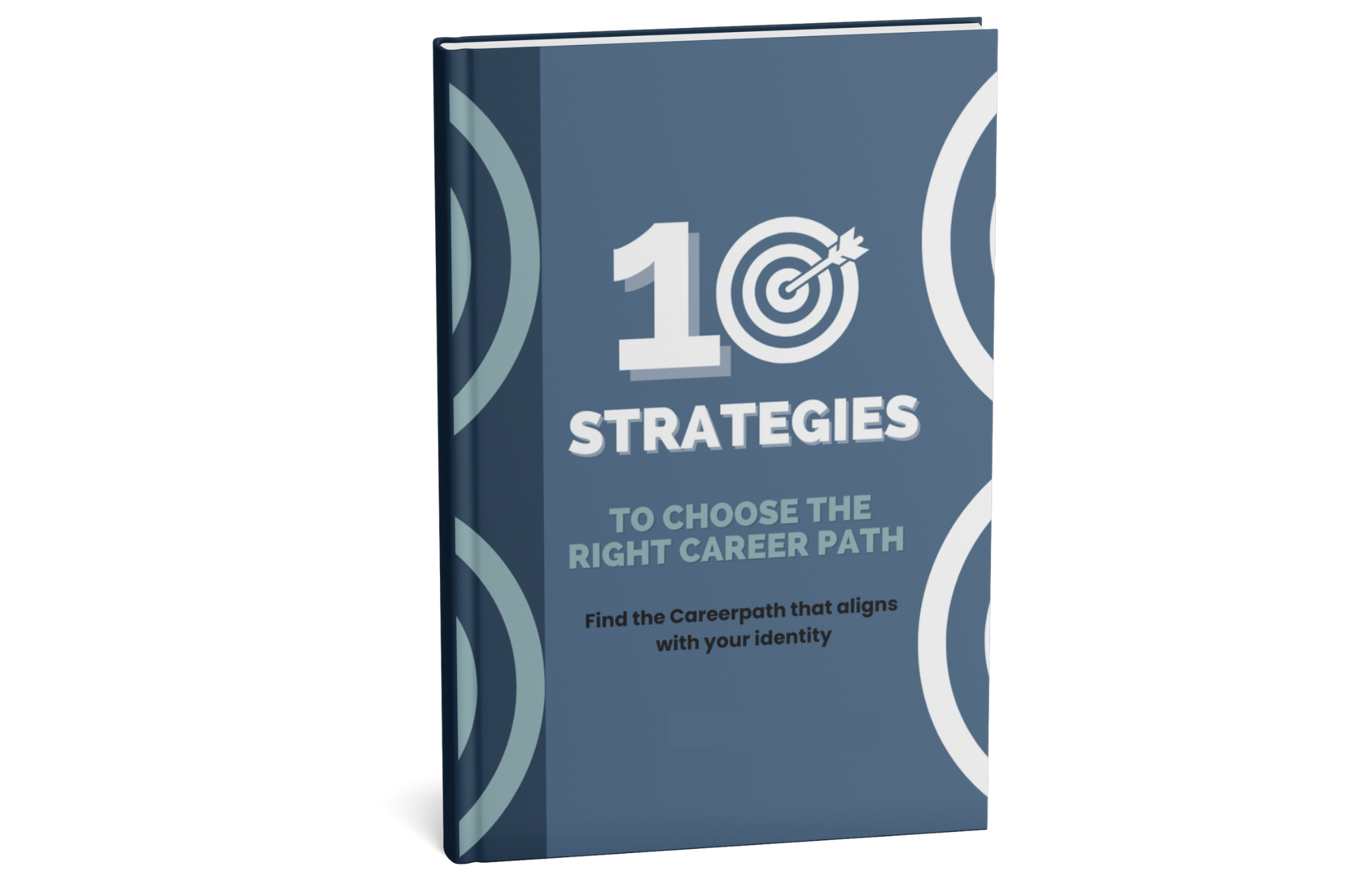
The new cover centers on a blue concentric-circle motif, a subtle bullseye that symbolizes clarity, focus, and trajectory—the very themes of the book.
Each ring represents a stage of career exploration: self-reflection, definition, alignment, and action.
The color palette—ranging from deep navy to soft azure—embodies trust, calm, and aspiration.
Typography was kept modern and restrained: clean sans-serif letterforms that project confidence without rigidity.
The design speaks in the visual language of self-development—elevated yet accessible.
The Process | From Clarity to Composition
Our design development unfolded through an iterative balance of symbolism and structure:
Research & Positioning
We analyzed competing titles in the career and personal-development space. Most leaned on photography or literal imagery. The insight: our readers respond more to conceptual visual cues than clichés.Concept Exploration
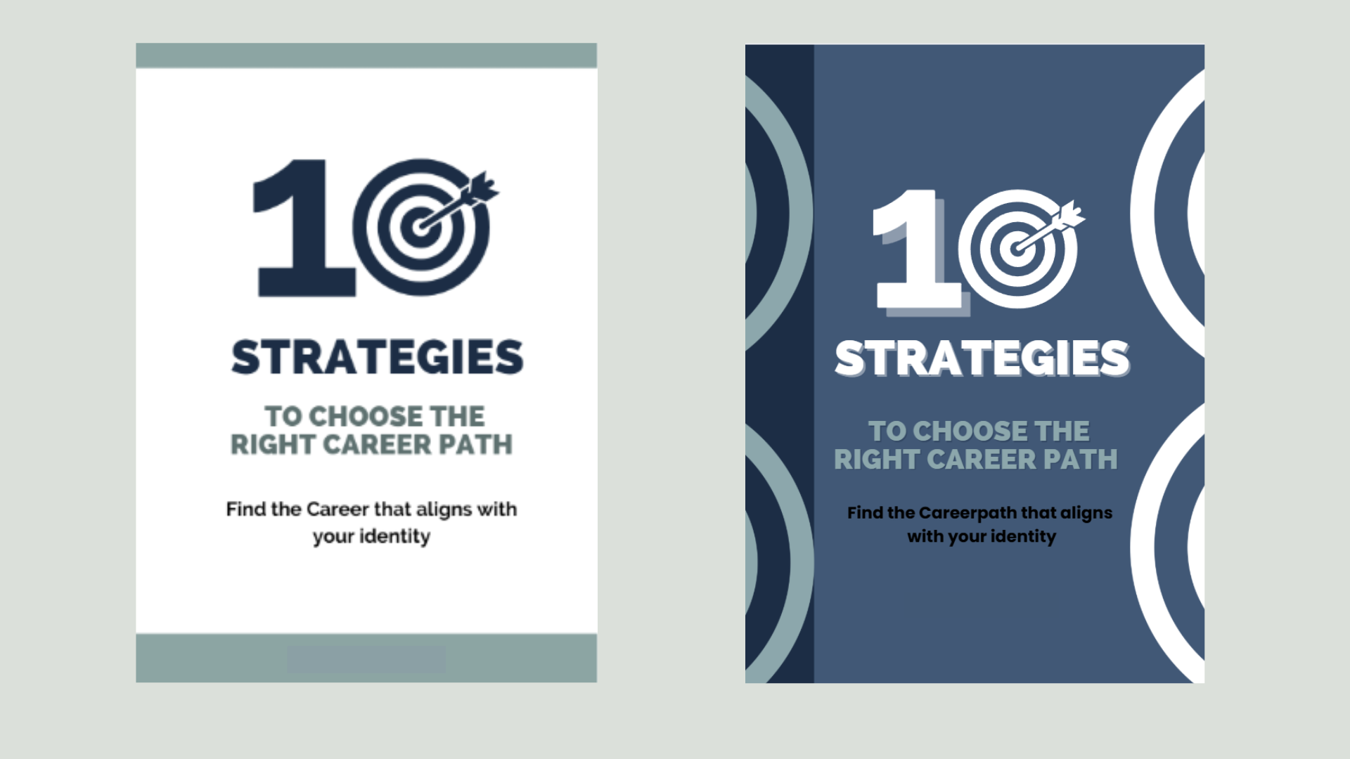
We experimented with shape psychology—arrows, paths, targets—and landed on the bullseye as the most universal symbol of purpose and precision.Color & Typography System
Shades of blue were layered to convey depth and progression. The bold uppercase title anchors the design, while spacing and alignment create rhythm and readability.
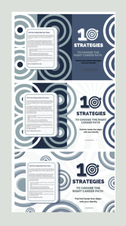
4. Refinement & Testing
Prototypes were tested digitally and in print and optimized for both matte and screen formats.
The Design | Minimalism in Motion
Every design decision served a dual purpose—aesthetic harmony and conceptual depth.
Circular gradient - evokes growth radiating from within.
White typographic framing - suggests structure around exploration.
Negative space - reinforces clarity and breathing room for the reader’s imagination.
Tagline placement (“Find Your Calling. Build Your Future.”) - acts as a steady horizon line across motion.
The design functions as both a visual compass and a motivational symbol, guiding readers before they even open the first page.
The Role | Direction, Design & Refinement
My role spanned creative direction, typography design, color strategy, and final production coordination.
Established the conceptual metaphor (“The Bullseye of Clarity”).
Designed multiple gradient and typographic iterations.
Refined layout for print and digital formats (front, spine, and back cover).
Cross checked design brief to ensure visual tone matched editorial updates.
Every stage reflected the book’s purpose: helping readers center themselves amid career uncertainty.
The Outcome | A Cover That Connects
The redesigned 10 Strategies – Second Edition achieved exactly what it set out to do:
engage, inspire, and guide.
“Readers described the new edition as approachable, clear, and motivating—just like the voice of the book itself.”
Post-launch, the redesign increased digital engagement and renewed interest from academic partners. The cover’s modern minimalism made the book stand out both online and on-shelf—proof that simplicity, when anchored in meaning, can outshine complexity.