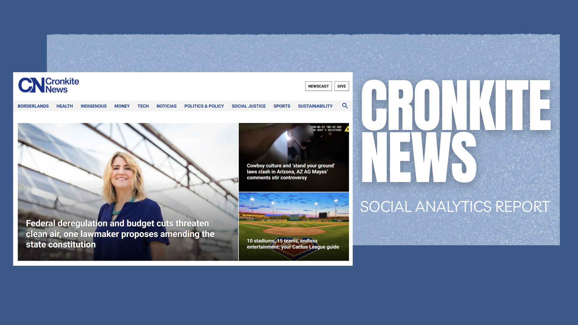
Cronkite News | Translating Analytics into Audience Growth
The Cronkite News Social Analytics Report transformed a month of engagement data into actionable insights—revealing not just what performed, but why it worked, and how the newsroom could grow its most valuable audiences.
The Brief | Turning Numbers into Narrative
Cronkite News wanted a clearer understanding of which social strategies attracted high-quality users—those who stay, read, and engage with content.
The analysis examined data from Facebook, Instagram, and Twitter between November 1 and December 9, 2022, with one guiding question:
How can Cronkite News use analytics to earn more meaningful audience engagement?
The report was designed to deliver three things:
A data-driven understanding of what content drives engagement.
Clear visualizations that don't just show numbers but tell a story.
Actionable recommendations for improving audience reach and retention.
The Vision | Insights That Empower Storytelling
The goal was to translate social media analytics into strategic storytelling—creating a presentation that could inform editorial, marketing, and leadership teams alike.
Each visualization revealed a part of the bigger picture:
Top-performing tweets and posts uncovered what tone, timing, and visuals worked best.
Audience demographic data pinpointed the core engaged user base—English-speaking males aged 35–44 from Phoenix, interested in news and politics.
Platform performance comparisons highlighted Facebook as the highest converter of engaged users.
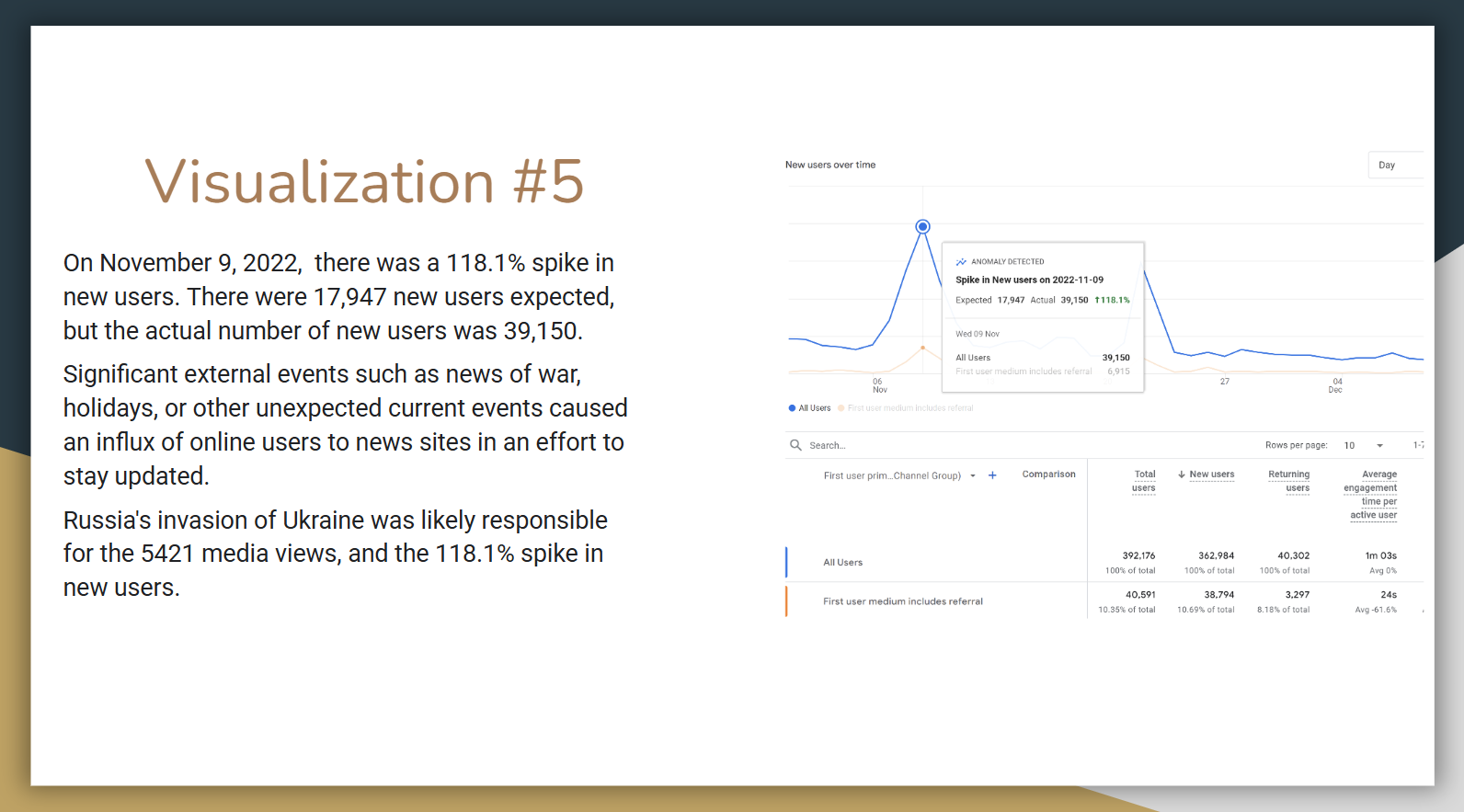
Traffic spikes connected user activity to major news events, demonstrating how external stories drive engagement surges.
The Process | From Data to Design
Our process followed a structured path of research, interpretation, and visualization:
1. Data Collection & Organization
Pulled and standardized engagement data across Facebook, Twitter, and Instagram. Tracked reach, link clicks, reactions, and key events such as 3+ pages visited.
2. Performance Analysis
Identified high-performing content, including a top tweet about the Phoenix Suns’ Nike Basketball jerseys (5,742 reach, 58 link clicks). Noted commonalities among successful posts: concise copy, visuals tied to local pride, and clear calls to action.
3. Audience Segmentation
Analyzed demographic data revealing that Cronkite’s most engaged followers were politically aware, local males aged 35–44—an audience with a clear appetite for news credibility and timeliness.
4. Visualization & Reporting
Developed slide visuals showing engagement trends, key event completions, and platform comparisons. Bar and line charts illustrated growth trajectories, while annotations framed insights in plain language.
5. Recommendations & Presentation
Delivered three core recommendations:
Target engaged demographics with tailored social ads.
Replicate top-performing Facebook messaging and visuals around news and politics.
Invest in paid social media to amplify proven organic strategies and maximize ROI.
The Design | Clarity Through Visualization
The report presentation emphasized clarity, flow, and accessibility—each chart and insight designed to inform at a glance.
Color-coded data visuals guided attention to key takeaways.
Minimal text blocks paired with headline-style summaries kept insights digestible.
Platform icons and user metrics reinforced the human side of analytics—transforming metrics into meaningful stories.
Every slide was built around one question: “What does this tell us about our audience?”
The Role | Analysis, Design & Strategic Insight
My role spanned data analytics, visual storytelling, and presentation design.
Analyzed platform metrics and user behavior data.
Created data visualizations and slide layouts aligned with Cronkite branding.
Interpreted findings into actionable strategies.
Delivered a cohesive report connecting numbers to narrative outcomes.
This project combined analytical rigor with editorial storytelling—showcasing the ability to bridge quantitative insight and creative presentation.
The Outcome | From Metrics to Momentum
The Cronkite News Analytics Report became a model for how data can drive strategy.
Key outcomes included:
Improved understanding of audience demographics and behavior.
Adoption of targeted ad recommendations to increase high-quality users.
Integration of data insights into editorial decision-making.
The project proved that when analytics are designed to tell a story, they become a catalyst for growth. Transforming raw data into a roadmap for engagement.


